03 — Logo
Logo System
COTLE has six official logo assets. Each has a specific context. Never mix them arbitrarily — use the decision guide below to choose the right one.
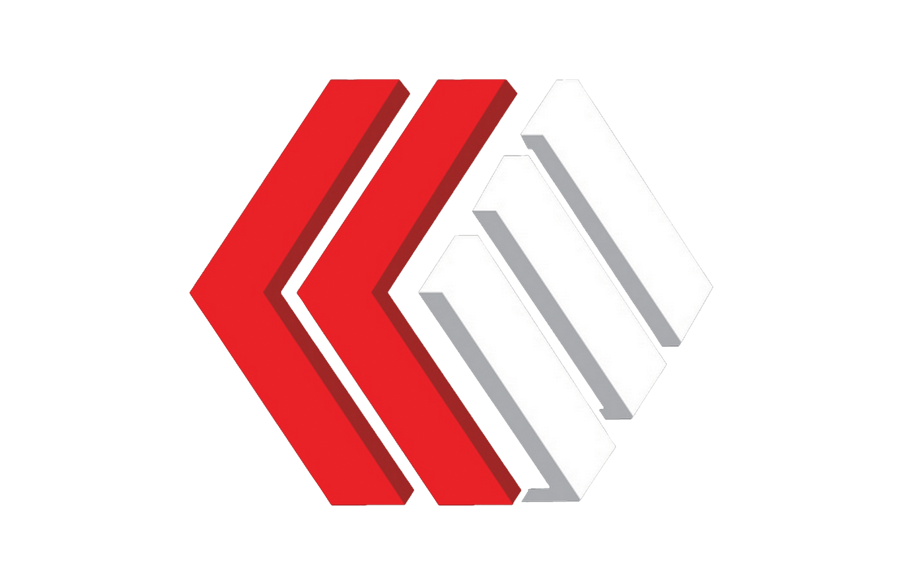
2026 Rebrand Logo
NEW
Black & White versions
Black on White
White on Dark
The new COTLE mark — bold, geometric, unmistakable.
Introduced in 2026, this logo features the full "CHURCH OLE" mark in a bold stacked layout. Use the black version on white or light backgrounds. Use the white version on dark, colored, or multimedia backgrounds. This logo is intended for all new and forward-facing brand contexts going forward.
Social
Print
Stage
Merch
Signage
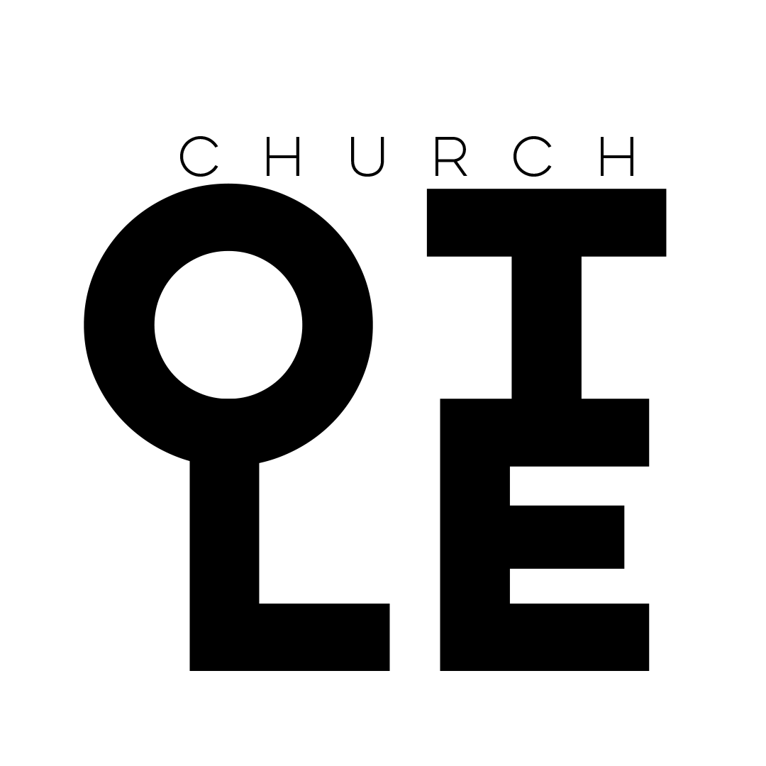
Primary Logo — Main
cotlelogo-sq25.png

Default use — everywhere.
The square stacked format with the concentric circle mark and full wordmark. This is the master logo. Use it for all primary brand touchpoints: social media profiles, church bulletins, email headers, presentations, signage, and merchandise.
Social
Print
Slides
Merch
Download PNG
Alt 1 — Name + Circles
COTLE-Name-with-CIrcles.png
Horizontal lockup with the circle mark beside the wordmark. Best for wide-format contexts where the square layout doesn't fit.
Web headers
Banners
Stage screens
Download PNG
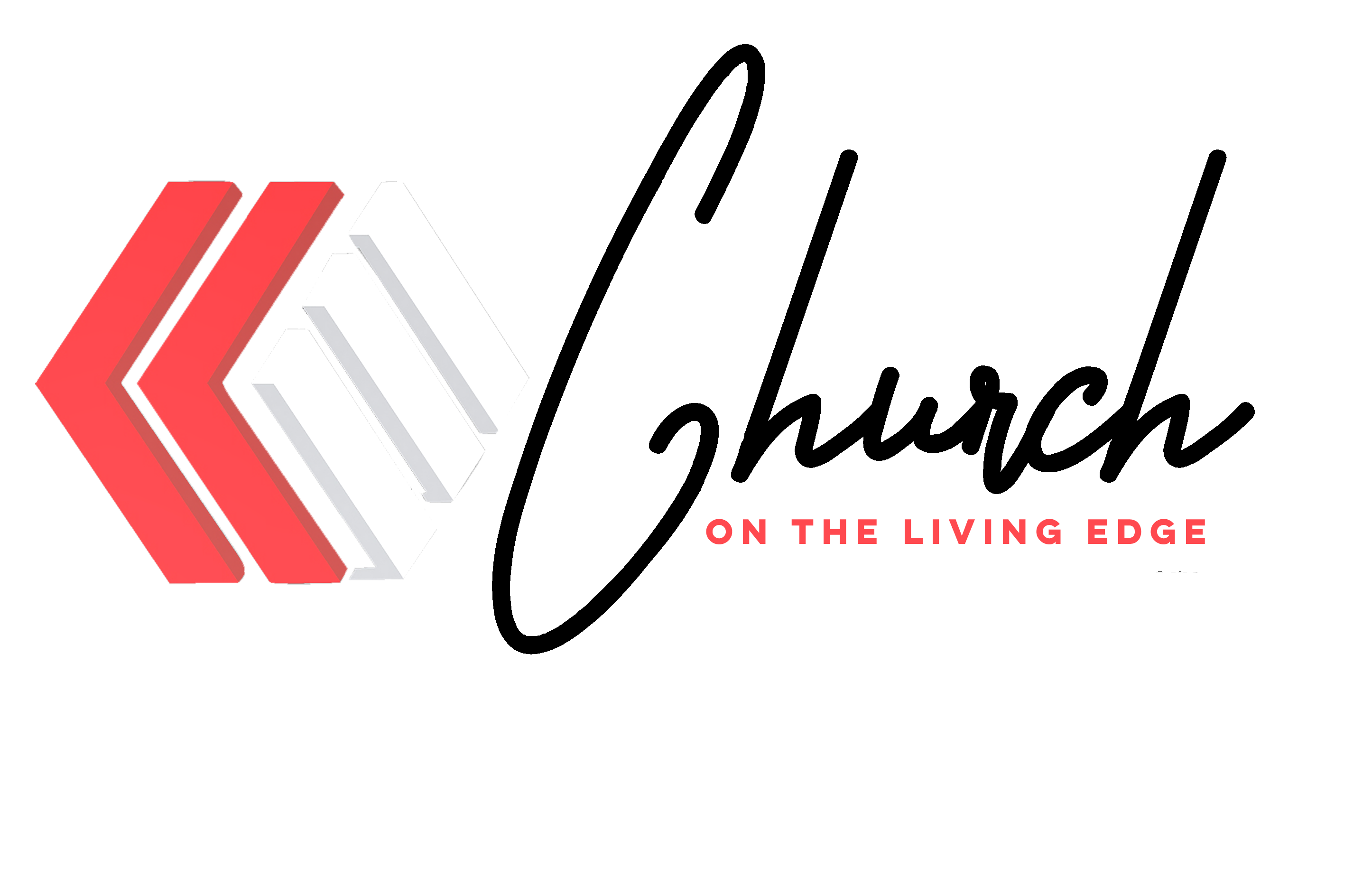
Alt 2 — Cursive
COTLE-LOGO-CURSIVE.png
Script/cursive treatment. Use for warmer, pastoral, or celebratory contexts — Easter, special services, invitation designs, anniversary materials.
Invitations
Holiday
Pastoral
Download PNG
Alt 3 — Words Stamp
Black & White versions
Black on Light
White on Dark
All-type stamp lockup. Full church name in stacked wordmark format with no circle mark. Use the black version on light/print backgrounds and the white version on dark digital backgrounds. For secondary branding positions where the mark is already present elsewhere.
Watermarks
Footer stamps
Co-branding
Print
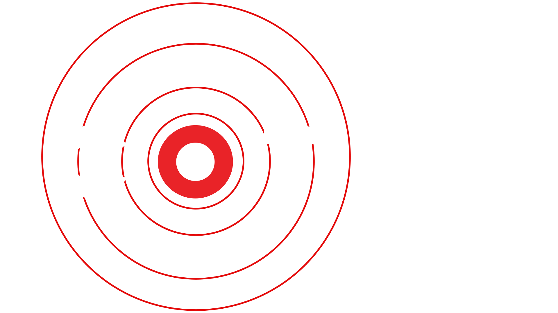
Icon — No BG
Cotle-Sqaure-NOBG2024.png
Circle mark only, transparent background. For app icons, favicons, profile thumbnails, and any context where a tight square or circular crop is needed.
App icon
Favicon
Profile photo
Stickers
Download PNG
Which Logo to Use
Situation
Use
Avoid
Social media profile picture, YouTube channel art, anywhere a square logo is needed
Main Logo
Cursive
Website header, stage projection, wide banner, YouTube banner
Alt 1
Icon only
Easter Sunday, holiday invitation, wedding/baby dedication materials
Alt 2 Cursive
Stamp
Document footer, co-branding with partner ministry, watermark on media
Alt 3 Stamp
Main Logo
App icon, favicon, small circular avatar, sticker
Icon
Any with text
Ministry Sub-Brands
kotle
Kids on the Living Edge
COTLE Groups
House at Home
Ablaze
Leadership Cohort
The Table
Food Pantry Ministry
ELITE Men
Fraternal Order
Youth Ministry
Students